Most of us must have come across situations where we will have to illustrate an idea or a concept for a presentation. Sometimes we simply want to make sense of the data we have or want to display in a way so others can easily make decisions based on that data.
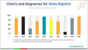
This infographics will turn your data into a visual version to express your information in a presentation, whether it’s a report for your company, your school or your friends. In this presentation you will find 10 infographic charts and diagrams, completely for free! to power your presentations and convey statistics more effectively. You can move any element, change color, shape, adjust sizes, and input your text.
Free charts and diagrams features.
You can use this free charts templates in PowerPoint, Google Slides themes or Keynote presentations. In this document you will find 10 different charts and diagrams to present statistical data. To use them you only have to copy to your Google Slides account or download it in pptx format, and copy paste in your own presentation.
- Presentation with 10 slides, each of them containning a different editable graphic.
- You can add text, change color, size, add elements, etc.
- Especially recommended for light color background presentations.
- Ratio 16/9. You can change to 4/3, but some graphics and icons may lose the proportion.
- You can download it as a PowerPoin template, use it as Google Slides theme and once you finish editing the presentation you can export to JPG, PDF, JPG, PPT, etc from the “Archive menu” in Google Slides.


Deja una respuesta